bolivar

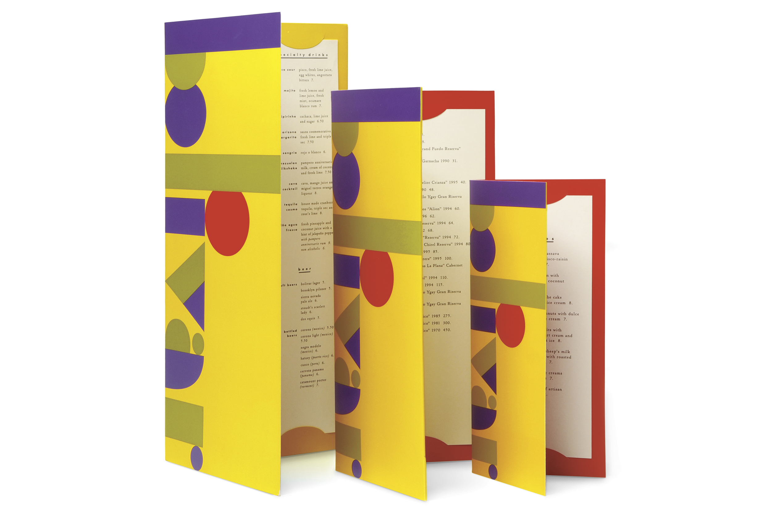
The chunky, two-tone typography of 1930s Spain inspired this type treatment, while the color palette was drawn from paintings selected for the restaurant. Blown up to fill the dimensions of the various menus, the bold logo treatment made for a memorable graphics system.


